title: ‘Dashboarding Frontier: Visualizing Model Health in Real Time’ summary: Learn how to track drift, latency, and business impact for production AI systems with an open analytics stack. date: 2024-04-20 authors:
- admin tags:
- ai-tutorial
- monitoring
- mlops image: caption: ‘Image credit: Unsplash’
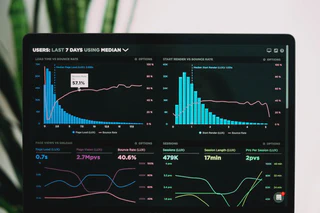
Visibility is everything when deploying AI in production. This guide walks through an end-to-end dashboard that surfaces the signals decision makers care about: performance, cost, and business outcomes—updated in near real time.
Table of Contents
Metrics that matter
| Layer | Metric | Description | Owner |
|---|---|---|---|
| Model | accuracy_rolling_7d | Prediction accuracy vs. human labels | Data science |
| Model | latency_p95_ms | 95th percentile response time | Platform |
| Model | token_usage_daily | Input + output tokens per provider | Finance |
| Business | conversion_uplift | Incremental upsell rate vs. control | Growth |
| Business | support_resolution_rate | Share of tickets closed by AI agent | Operations |
Align on these metrics before writing a single line of code.
Stack architecture
We pair a fast analytics warehouse (DuckDB/MotherDuck) with interactive front ends (Observable, Plotly Dash) to keep iteration fast.
Build the warehouse model
-- models/model_performance.sql
SELECT
  session_id,
  provider,
  response_time_ms,
  accuracy,
  tokens_input,
  tokens_output,
  created_at::date AS event_date
FROM {{ ref('raw_llm_events') }}
-- models/business_impact.sql
SELECT
  ticket_id,
  resolved_by,
  resolution_time_minutes,
  revenue_generated,
  created_at::date AS event_date
FROM {{ ref('raw_support_events') }}
Blend AI and business metrics
-- models/dashboard_facts.sql
SELECT
  m.event_date,
  m.provider,
  AVG(m.accuracy) AS accuracy_rolling_7d,
  PERCENTILE_CONT(0.95) WITHIN GROUP (ORDER BY m.response_time_ms) AS latency_p95_ms,
  SUM(m.tokens_input + m.tokens_output) AS tokens_total,
  SUM(b.revenue_generated) AS revenue_from_ai,
  AVG(CASE WHEN b.resolved_by = 'agent' THEN 1 ELSE 0 END) AS resolution_rate
FROM {{ ref('model_performance') }} m
LEFT JOIN {{ ref('business_impact') }} b
  ON m.session_id = b.ticket_id
GROUP BY 1, 2
Visualize with Plotly
import duckdb
import plotly.express as px

con = duckdb.connect("md:indoai_dashboard")
df = con.execute("SELECT * FROM dashboard_facts WHERE provider = 'OpenAI'").fetch_df()

fig = px.line(
    df,
    x="event_date",
    y=["accuracy_rolling_7d", "resolution_rate"],
    labels={"value": "Rate", "variable": "Metric"},
    title="Accuracy vs. Resolution Rate"
)
fig.show()
Embed the chart inside your Hugo page using {{< chart data="line-chart" >}} once you export the Plotly JSON.
Alert the team
- Set threshold alerts in Metabase:
latency_p95_ms > 1200triggers Slack notification. - Send daily email digests summarizing accuracy and token spend.
- Log anomalies to Sentry or PagerDuty for on-call investigation.
Rollout plan
- Week 1 — Instrument logging and ship warehouse models.
- Week 2 — Launch executive dashboard (accuracy, latency, cost).
- Week 3 — Add business uplift metrics and set alert thresholds.
- Week 4 — Automate narrative summaries with templated LLM reports.
Looking for Indonesian guidance? Use the language switcher for a localized walkthrough.